 Image credit: Youtube
Cocktail recipes analysis
Introduction
For this first blog post I thought I’d take a recent #TidyTuesday dataset and do some analysis of it. Where better to start than one of my favourite things? Cocktails! You can find the dataset and information about it here. Basically it’s a list of cocktail recipes from the most popular drink-mixing guide in America, called the “Mr Boston Offical Bartender’s Guide”, which first published in 1935. This is from the latest edition.
Firstly I’d like to acknowledge Julia Silge and David Robinson, whose approaches to analysing this dataset I enjoyed. In this post I’ve taken some of their ideas and then developed them for my own purposes.
I will first clean the data, do some exploratory analysis, then apply some unsupervised learning techniques to see what patterns we can find.
Data pre-processing
Let’s load the cocktails receipes dataset and take a quick look at it:
boston_cocktails <- readr::read_csv("https://raw.githubusercontent.com/rfordatascience/tidytuesday/master/data/2020/2020-05-26/boston_cocktails.csv")

boston_cocktails %>% head()
## # A tibble: 6 x 6
## name category row_id ingredient_number ingredient measure
## <chr> <chr> <dbl> <dbl> <chr> <chr>
## 1 Gauguin Cocktail Class… 1 1 Light Rum 2 oz
## 2 Gauguin Cocktail Class… 1 2 Passion Fruit S… 1 oz
## 3 Gauguin Cocktail Class… 1 3 Lemon Juice 1 oz
## 4 Gauguin Cocktail Class… 1 4 Lime Juice 1 oz
## 5 Fort Lauder… Cocktail Class… 2 1 Light Rum 1 1/2 …
## 6 Fort Lauder… Cocktail Class… 2 2 Sweet Vermouth 1/2 ozSo basically on each line we have the name of the cocktail, its category, then each ingredient in it and the amount of it required. There are 989 drinks in this dataset featuring 569 unique ingredients.
Let’s see what the 20 most common ingredients are:
boston_cocktails %>%
  count(ingredient, sort = TRUE) %>%
  slice(1:20)
## # A tibble: 20 x 2
## ingredient n
## <chr> <int>
## 1 Gin 176
## 2 Fresh lemon juice 138
## 3 Simple Syrup 115
## 4 Vodka 114
## 5 Light Rum 113
## 6 Dry Vermouth 107
## 7 Fresh Lime Juice 107
## 8 Triple Sec 107
## 9 Powdered Sugar 90
## 10 Grenadine 85
## 11 Sweet Vermouth 83
## 12 Brandy 80
## 13 Lemon Juice 70
## 14 Blanco tequila 69
## 15 Egg White 67
## 16 Angostura Bitters 63
## 17 Juice of a Lemon 60
## 18 Pineapple Juice 47
## 19 Bourbon whiskey 38
## 20 Orange Bitters 38Look at entries 2, 13 and 17. It’s all just lemon juice with different names! We need to do some data cleaning. In the next section we modify the ingredient column to deal with various issues described in the in-line comments.
# Adapted from Julia Silge's code
cocktails_parsed <- boston_cocktails %>%
  mutate(
    ingredient = str_to_lower(ingredient),  # make everything lower case
    ingredient = str_replace_all(ingredient, "-", " "), # Remove dashes
    # Remove some stop words
    ingredient = str_remove(ingredient, " liqueur$"),
    ingredient = str_remove(ingredient, " (if desired)$"),
    # Consolidate all types of bitters into 'bitters', lemons to 'lemon juice', whiskies to 'whiskey', etc
    ingredient = case_when(
      str_detect(ingredient, "bitters") ~ "bitters",
      str_detect(ingredient, "lemon") ~ "lemon juice",
      str_detect(ingredient, "lime") ~ "lime juice",
      str_detect(ingredient, "grapefruit") ~ "grapefruit juice",
      str_detect(ingredient, "orange") ~ "orange juice",
      str_detect(ingredient, "whiskey") ~ "whiskey",
      str_detect(ingredient, "rum") ~ "rum",
      TRUE ~ ingredient
    ),
    # Looks like units of bitters are erroneously given as ounces - change this to 'dash'
    measure = case_when(
      str_detect(ingredient, "bitters") ~ str_replace(measure, "oz$", "dash"),
      TRUE ~ measure
    ),
    # Change fractions to decimals in the measure column
    measure = str_replace(measure, " ?1/2", ".5"),
    measure = str_replace(measure, " ?3/4", ".75"),
    measure = str_replace(measure, " ?1/4", ".25"),
    # parse the number out of the measure, we can use this later
    measure_number = parse_number(measure),
    measure_number = if_else(str_detect(measure, "dash$"),
      measure_number / 50,
      measure_number
    )
  )
cocktails_parsed
## # A tibble: 3,643 x 7
## name category row_id ingredient_numb… ingredient measure measure_number
## <chr> <chr> <dbl> <dbl> <chr> <chr> <dbl>
## 1 Gauguin Cocktail … 1 1 rum 2 oz 2
## 2 Gauguin Cocktail … 1 2 passion fr… 1 oz 1
## 3 Gauguin Cocktail … 1 3 lemon juice 1 oz 1
## 4 Gauguin Cocktail … 1 4 lime juice 1 oz 1
## 5 Fort L… Cocktail … 2 1 rum 1.5 oz 1.5
## 6 Fort L… Cocktail … 2 2 sweet verm… .5 oz 0.5
## 7 Fort L… Cocktail … 2 3 orange jui… .25 oz 0.25
## 8 Fort L… Cocktail … 2 4 lime juice .25 oz 0.25
## 9 Apple … Cordials … 3 1 apple schn… 3 oz 3
## 10 Apple … Cordials … 3 2 cinnamon s… 1 oz 1
## # … with 3,633 more rowsLet’s have another look at the most frequent ingredients:
cocktails_parsed %>%
  count(ingredient, sort = TRUE)
## # A tibble: 405 x 2
## ingredient n
## <chr> <int>
## 1 lemon juice 311
## 2 rum 184
## 3 lime juice 180
## 4 gin 176
## 5 bitters 166
## 6 whiskey 138
## 7 orange juice 124
## 8 simple syrup 115
## 9 vodka 114
## 10 dry vermouth 107
## # … with 395 more rowsWe now have 405 of them, which is still too many. Let’s filter for ingredients that appear at least 15 times:
cocktails_parsed_filtered <- cocktails_parsed %>%
  add_count(ingredient) %>% # get a count of ingredients so we can filter out rare ones
  filter(n >= 15) %>%  # ingredient must appear at least 15 times
  select(-n) %>%
  distinct(row_id, ingredient, .keep_all = TRUE) %>%    # to stop repetitions e.g. if we had lemon slice and lemon juice in a recipe then we will end up with 2 'lemon's as per our mutate() calls earlier
  na.omit()

num_ingreds <- cocktails_parsed_filtered %>%
  distinct(ingredient) %>%
  summarise(n = n()) %>%
  as.integer()

num_ingreds
## [1] 39So we now have 39 different ingredients in our dataset. Time for some exploratory analysis.
Exploratory Data Analysis
Let’s take another look at the most common ingredients, this time as a graph:
cocktails_parsed_filtered %>%
        count(ingredient, sort = TRUE) %>%
        head(20) %>%
        mutate(ingredient = fct_reorder(ingredient, n)) %>%
        ggplot(aes(n, ingredient)) +
        geom_col() +
        labs(title = "Top 20 most common ingredients in cocktail recipes",
             x = "Count") +
        theme(axis.text = element_text(size = 13),
              axis.title = element_text(size = 15))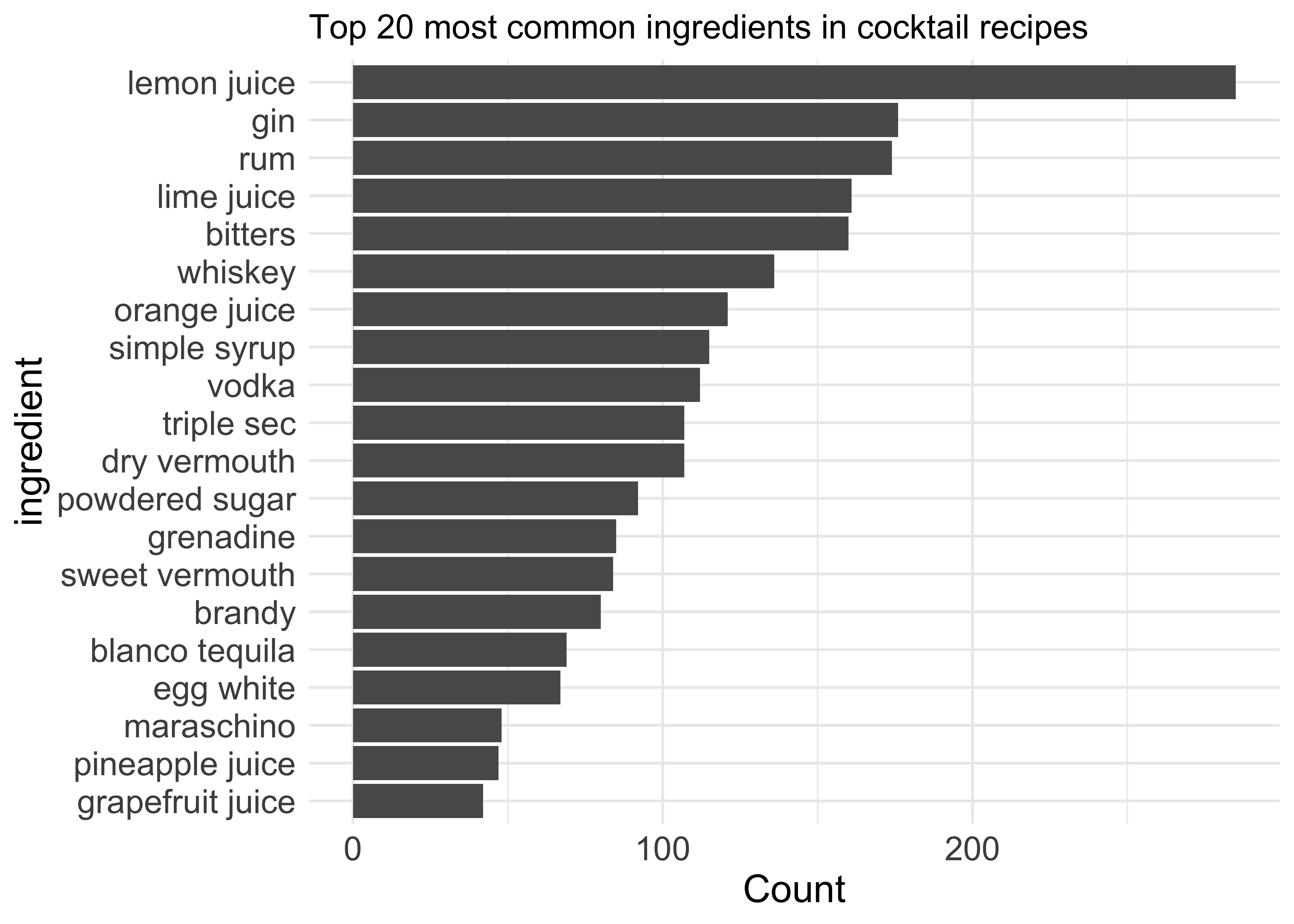
This looks much better. Unsurprisingly lemon juice is at the top, while the most common alcoholic ingredient is gin closely followed by rum. Bitters, whiskey and vodka are also very popular, which won’t come as any surprise if you go to bars quite frequently like I do.
Let’s see how these numbers are broken down by another of the variables, category of cocktail, shown in colour in the next plot. I’ve changed the x-axis to “Percentage of all recipes” so we get a better idea of how common they really are:
n_recipes <- n_distinct(cocktails_parsed_filtered$name)  # get the total no.recipes

cocktails_parsed_filtered %>%
        mutate(category = fct_lump_n(category, 8),  # Get the 6 most frequent categories and lump the rest into 'Other'
               ingredient = fct_lump_n(ingredient, 20)) %>%
        filter(ingredient != "Other") %>%
        count(category, ingredient, sort = TRUE) %>%  # D. Robinson included this line a few lines too early, e.g. vodka was erroneously being included in 'Other'
        mutate(ingredient = fct_reorder(ingredient, n, sum)) %>%
        ggplot(aes(n/n_recipes, ingredient, fill = category)) +   # turn x-axis into %
        geom_col() +
        scale_x_continuous(labels = percent_format()) +
        scale_fill_brewer(palette = "Set1") + # change default colour scheme
        labs(title = "Most common ingredients broken down by drink category",
             x = "% of all recipes",
             y = "Ingredient",
             fill = "Category") +
        theme(axis.text = element_text(size = 13),
              axis.title = element_text(size = 15))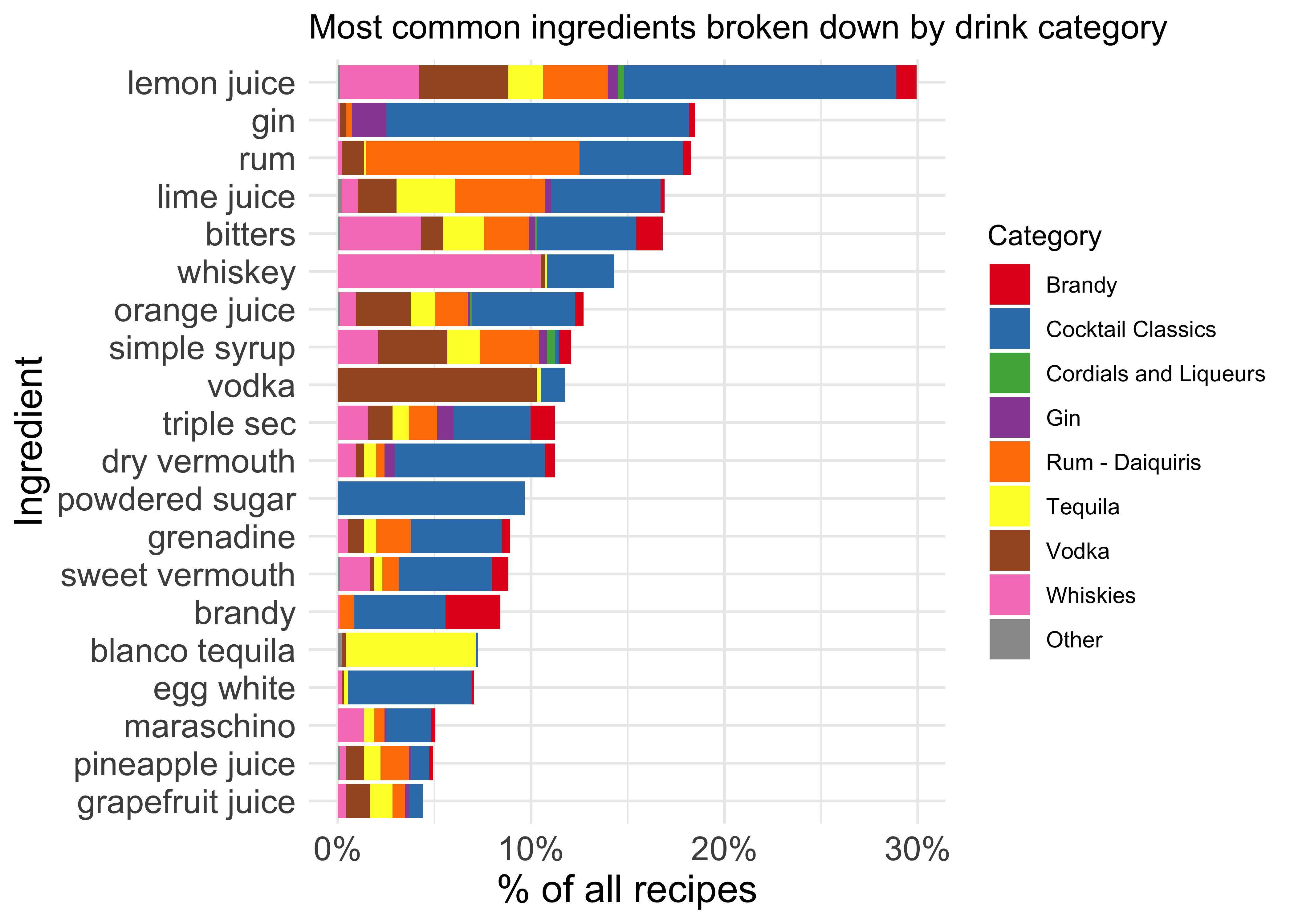
I think this break-down by category isn’t particularly reliable - for example, most drinks containing gin aren’t in the ‘Gin’ category. The ‘Cocktail Classics’ category seems to include plenty of drinks which could be placed in other categories. Perhaps a better way to organise this data would have been to allow multiple categories per drink?…We’ll revisit this later.
Co-occurrence of ingredients
Let’s look at another question now: Which ingredients tend to appear together in the same recipe?
First we calculate correlation between ingredients:
library(widyr)
library(tidytext)

ingredient_pairs <- cocktails_parsed_filtered %>%
        add_count(ingredient) %>%   # like group_by then count
        filter(n >= 5) %>% # filter only for ingredients that appear in min. 5 recipes
        pairwise_cor(ingredient, name, sort = TRUE)

ingredient_pairs
## # A tibble: 1,482 x 3
## item1 item2 correlation
## <chr> <chr> <dbl>
## 1 whole egg powdered sugar 0.361
## 2 powdered sugar whole egg 0.361
## 3 port powdered sugar 0.278
## 4 powdered sugar port 0.278
## 5 dry vermouth gin 0.276
## 6 gin dry vermouth 0.276
## 7 egg yolk powdered sugar 0.251
## 8 powdered sugar egg yolk 0.251
## 9 lime juice rum 0.251
## 10 rum lime juice 0.251
## # … with 1,472 more rowsNow let’s see which ingredients are most closely correlated with some of the most popular ones:
ingredient_pairs %>%
        filter(item1 %in% c("lemon juice", "gin", "rum", "whiskey", "vodka")) %>%
        group_by(item1) %>%
        top_n(8, correlation) %>%
        ungroup() %>%   # wasn't included in D. Robinson's code, but is needed
        mutate(item2 = reorder_within(item2, by = correlation, within = item1)) %>%  # need the 'within' argument for faceting
        ggplot(aes(correlation, item2)) +
        geom_col() +
        facet_wrap(~ item1, scales = "free_y") +
        scale_y_reordered() +
        labs(title = "Which ingredients are most correlated with selected ones?",
             y = "Most correlated ingredients") +
        theme(text = element_text(size= 12))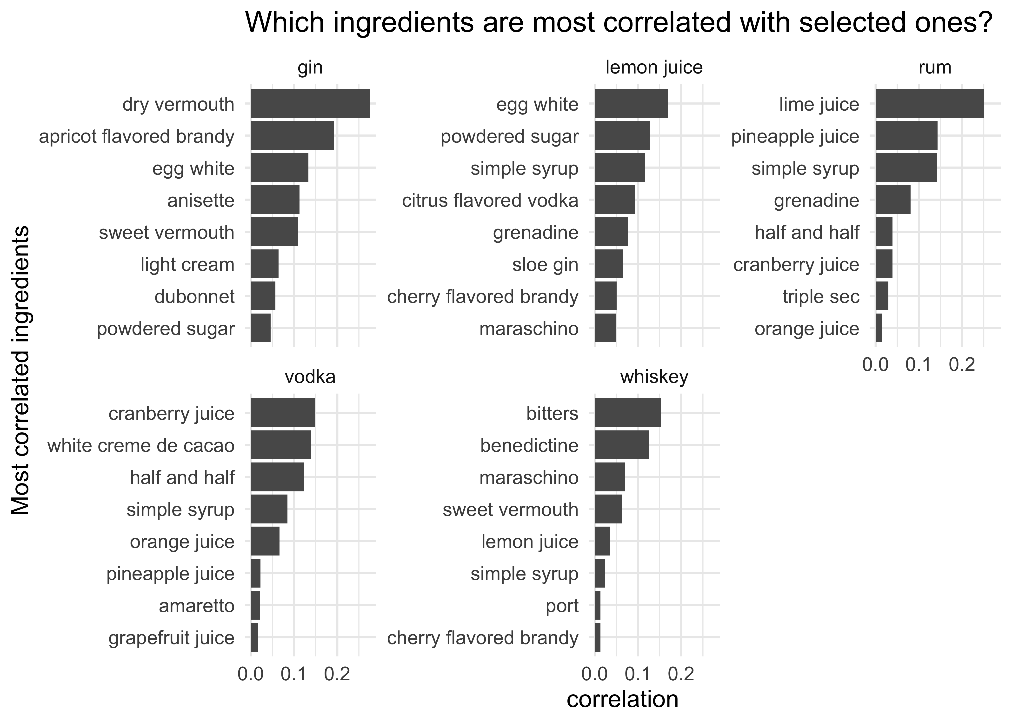
These plots make sense: gin is often found with vermouth, which is how you make martinis and negronis; lemon juice is often found with sugar/syrup to balance out the acidity; while rum and lime juice is a classic combination as are vodka/cranberry juice and whiskey/bitters.
Incidentally I didn’t realise that gin is often combined with apricot-flavoured brandy but further investigation reveals that there are 18 such drinks!:
cocktails_parsed_filtered %>%
  group_by(name) %>%
  filter(all(c("gin", "apricot flavored brandy") %in% ingredient)) %>%
  arrange(name) %>%
  distinct(name)
## # A tibble: 18 x 1
## # Groups: name [18]
## name
## <chr>
## 1 Apricot Anise Collins
## 2 Apricot Anisette Collins
## 3 Apricot Cocktail
## 4 Bermuda Rose
## 5 Fairy Belle Cocktail
## 6 Favorite Cocktail
## 7 Favourite Cocktail
## 8 Frankenjack Cocktail
## 9 Golden Dawn
## 10 K. G. B. Cocktail
## 11 K.G.B. Cocktail
## 12 Resolute Cocktail
## 13 Webster Cocktail
## 14 Wembley Cocktail
## 15 Wembly Cocktail
## 16 Western Rose
## 17 What The Hell
## 18 Why Not?Network analysis
R has a couple of nice packages for displaying network graphs, ggraph and igraph. Let’s use them to plot the ‘connectedness’ of our data. Although not formally an unsupervised learning technique this should give us an idea as to what kind of clusters exist in the data: ingredients which are often found in the same drink will be more closely connected.
library(ggraph)
library(igraph)
library(ggrepel)

ingredients_summarized <- cocktails_parsed_filtered %>%
        group_by(name) %>%
        mutate(percentile = row_number() / n()) %>%  # Tells us relative position of ingredient in drink - accounts for fact that some recipes have many ingredients and some don't
        ungroup() %>%
        group_by(ingredient) %>%
        summarize(n = n(),
                  avg_position = mean(percentile), # get average position in drink of ingredient
                  avg_serving = mean(measure_number, na.rm = TRUE)) %>%  # get average serving measure of ingredient
        arrange(desc(n))

# Get top 70 correlated ingredients
top_cors <- ingredient_pairs %>% head(70)

# Filter ingredients_summarised for only highly correlated ingredients
ingredient_info <- ingredients_summarized %>%
        filter(ingredient %in% top_cors$item1) %>%
        distinct()

# Generate network graph

set.seed(3)

top_cors %>%
        graph_from_data_frame(vertices = ingredient_info) %>%
        ggraph(layout = "fr") +
        geom_edge_link() +
        geom_node_text(aes(label = name), repel = TRUE) +
        geom_node_point(aes(size = 1.1* n)) +
        geom_node_point(aes(size = n, color = avg_position)) +
        scale_color_gradient2(low = "blue", high = "red", midpoint = .63,
                              labels = scales::percent_format()) +
        labs(size = "# of recipes",
             color = "Avg position in drink",
             title = "Network of cocktail ingredients",
             subtitle = "Connected ingredients tend to appear in the same drink. A bluer data point indicates \nthat it tends to appear earlier in recipes.")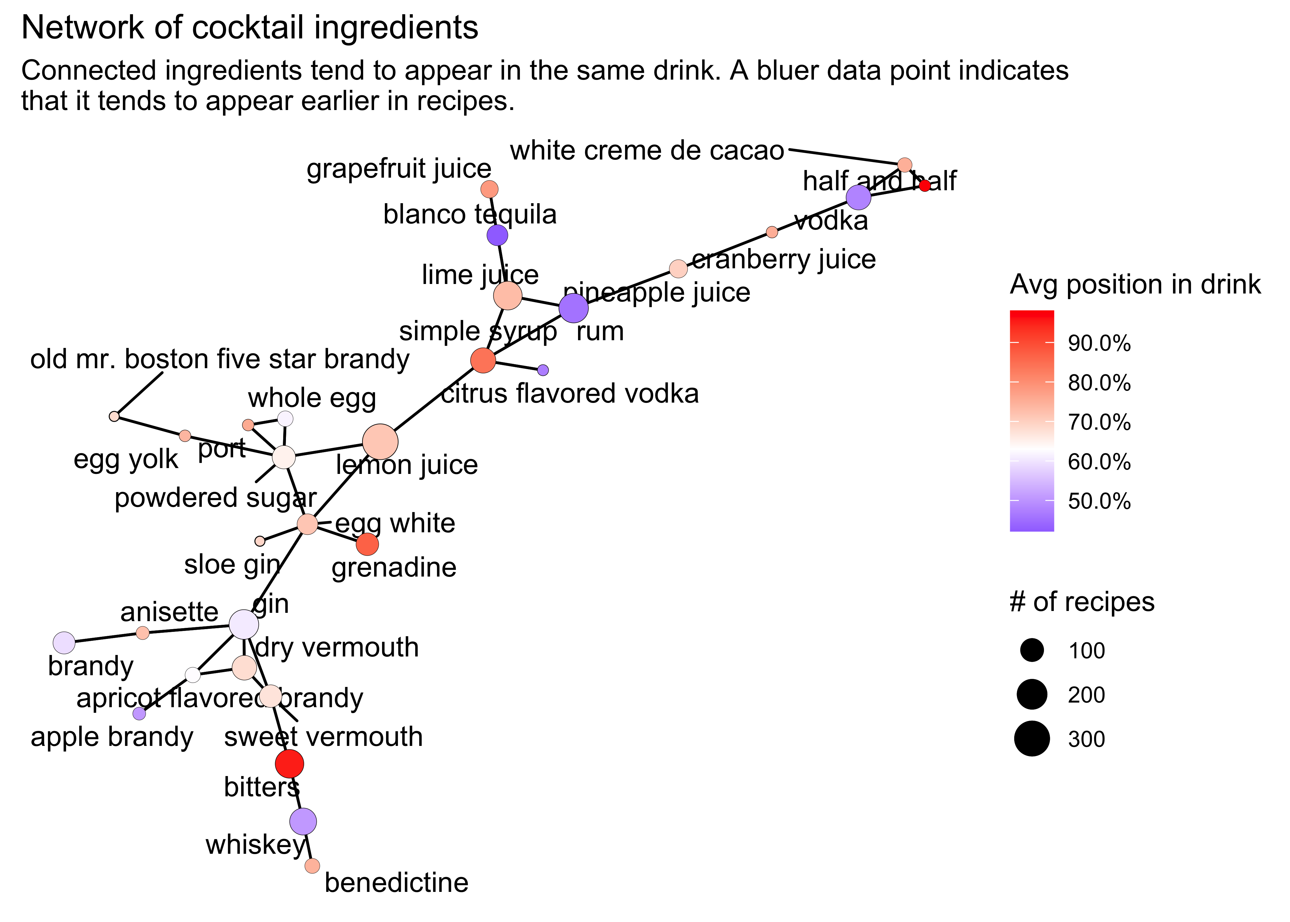
This is a nice plot! As before, we see popular combinations of ingredients (e.g. whiskey/bitters, gin/vermouth, lemon juice/sugar) but now we can see the full picture. Unsurprisingly the spirits tend to be quite far apart (except for gin and brandy) and surrounded by flavouring agents such as juices and soft liqueurs. The bluer colour of the spirits show that they tend to be earlier in the drink recipes.
If in doubt as to what kind of drink to make next time you’re hosting a party this might be a good starting point!
Unsupservised Learning
Lastly, we can try some more formal unsupervised learning techniques to investigate our data: Principal Component Analysis (PCA) and t-Distributed Stochastic Neighbour Embedding (t-SNE).
Principal component analysis
PCA is a classic unsupervised learning technique. I won’t explain the details of it here, but for anyone unfamilar with it we can summarise the purpose of PCA as follows:
“When faced with a large set of correlated variables, PCA allows us to summarize this set with a smaller number of representative variables that collectively explain most of the variability in the original set…PCA also serves as a tool for data visualization.”
Essentially, PCA involves performing a linear mapping of the data to a lower-dimensional space such that it helps us understand where most of the variance came from in the original data. To illustrate this, see the following plot which shows the ingredients with the highest values (both positive and negative) in the first two principal components:
## Adapted from Julia Silge's code

# Pivot the data to get the ingredients as columns i.e. get a highly-dimensional dataset
cocktails_df <- cocktails_parsed_filtered %>%
  mutate(category = fct_lump_n(category, 7)) %>%
  select(-ingredient_number, -row_id, -measure) %>%
  pivot_wider(names_from = ingredient, values_from = measure_number, values_fill = 0) %>%
  janitor::clean_names() %>%
  arrange(name) %>%
  na.omit()


# Use new tidymodels package to run PCA
library(tidymodels)

pca_rec <- recipe(~., data = cocktails_df) %>%
  update_role(name, category, new_role = "id") %>%
  step_normalize(all_predictors()) %>%   # centers and scales all predictors
  step_pca(all_predictors())

pca_prep <- prep(pca_rec)

tidied_pca <- tidy(pca_prep, 2)

# Visualise the principal components
library(tidytext)

tidied_pca %>%
  filter(component %in% paste0("PC", 1:2)) %>%
  group_by(component) %>%
  top_n(8, abs(value)) %>%
  ungroup() %>%
  mutate(terms = reorder_within(terms, by = abs(value), within = component)) %>%  # from tidytext package - reorders column before plotting with faceting, such that the values are ordered within each facet...needs scale_x_reordered or scale_y_reordered to be used later
  ggplot(aes(value, terms, fill = value > 0)) +
  geom_col() +
  facet_wrap(~component, scales = "free_y") +
  scale_y_reordered() +  # see earlier comment
  labs(
    x = "Absolute value of contribution",
    y = NULL, fill = "Positive?"
  ) +
  guides(fill=FALSE) +
  theme(axis.text = element_text(size = 13),
        axis.title = element_text(size = 14))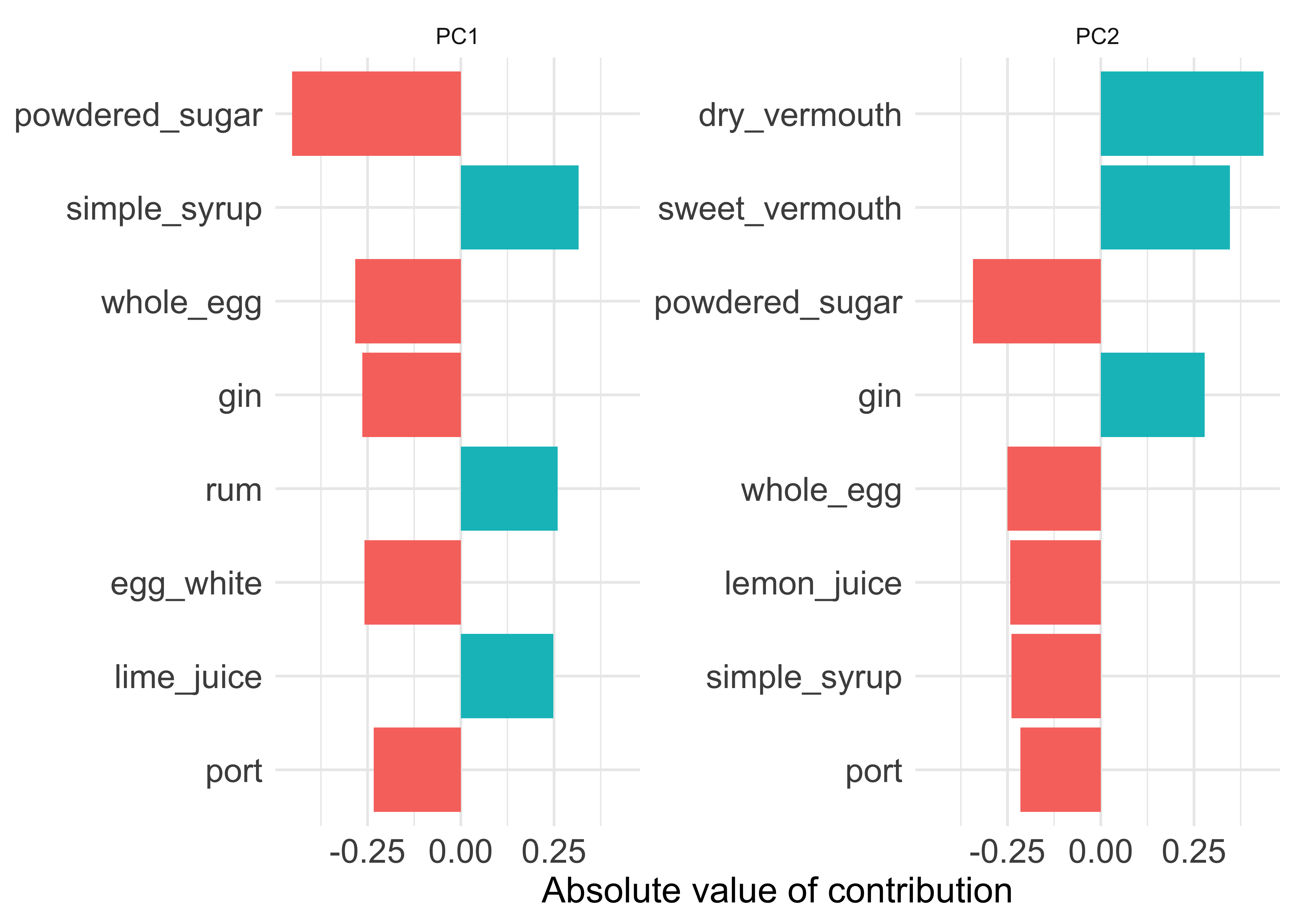
We can infer from this that PC1 mainly tells us about the contrast between gin/sugar/egg drinks one one side versus the rum/lime/syrup drinks on the other. PC2 is mostly about the gin/vermouth drinks (i.e. martinis) versus the sweet/eggy/lemony drinks. This tallies with our network analysis from earlier, where you can make out these little clusters in the graph if you look closely:
t-SNE
Finally we come to t-SNE, a more modern technique for data dimensionality reduction and visualisation. Again I won’t go into the details here, but the key thing to know is that unlike PCA, which focusses on representing variance in the original data, t-SNE tries to find a two-dimensional represenation of the data that preserves the distances between points as best as possible. That is, instances which are close together in the original (high dimensional) feature space are kept close together, while instances which are far apart in the original feature space are kept far apart. We can use it to get an idea of what clusters exist in the original feature space.
Here we will apply t-SNE to a question that came up earlier - how much of an overlap is there between the Classic Cocktail category and the other ones? Below is the output of the t-SNE algorithm. Note that the x- and y-dimensions don’t have any intuitive meaning here, we are just interested in how close the data are to each other and whether we can discern any clusters.
library(Rtsne)

set.seed(42)

tsne_features <- cocktails_df %>% select(-c(1,2)) # Remove non-numeric features from the dataset, i.e. only data about the ingredient measures

tsne_obj <- Rtsne(tsne_features, perplexity = 20, check_duplicates = FALSE) # Run t-SNE

tt <- as_tibble(tsne_obj$Y)

ggplot(data = tt, mapping = aes(x = V1, y = V2)) +
        geom_point() +
      labs(title = "t-SNE plot of cocktail data. Each dot is a drink.",
           x = "Dimension 1",
y = "Dimension 2") 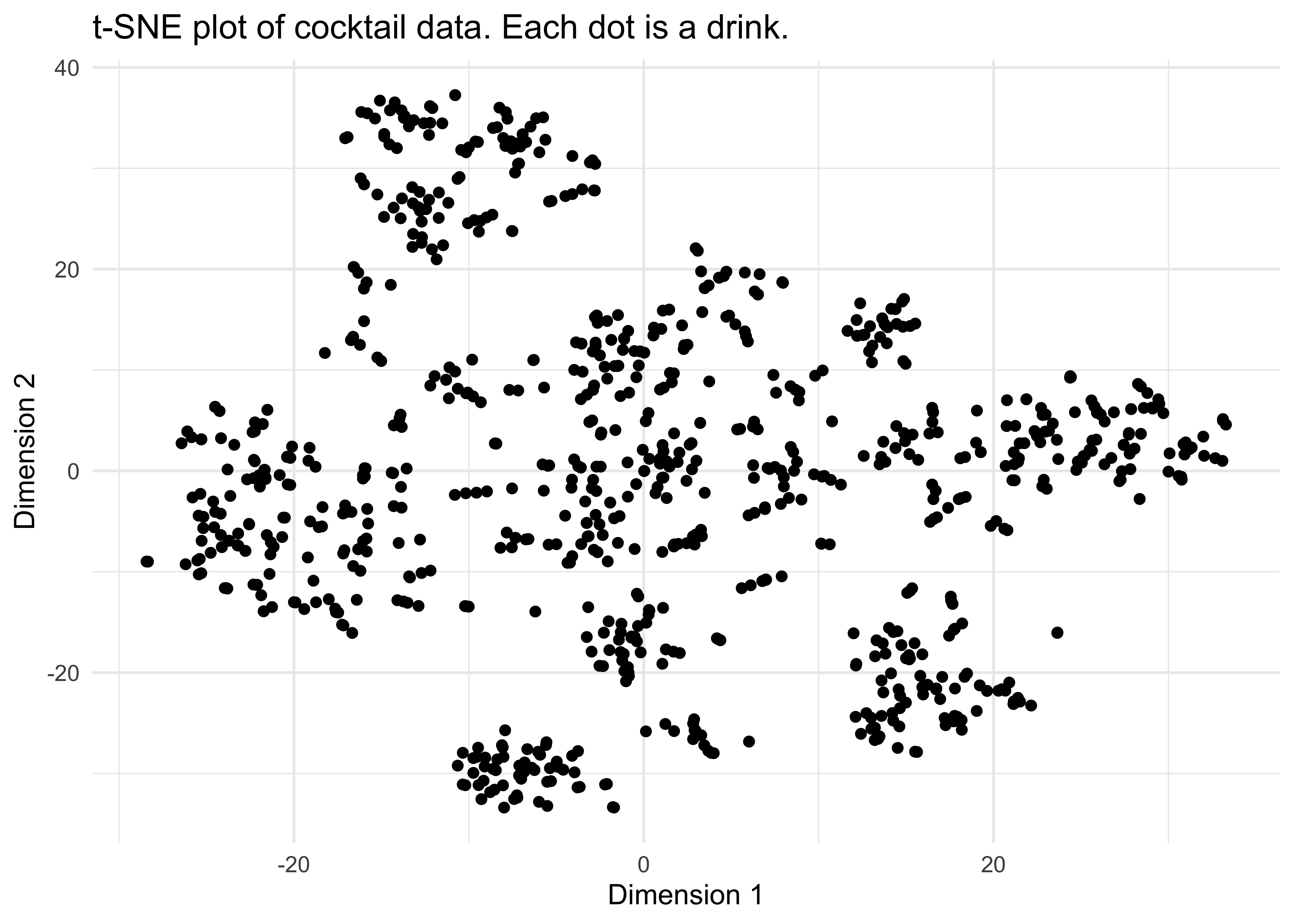
It looks like we do have some clusters here - do they correspond to the various categories of cocktail? In the next plot I have coloured each data point according to its category:
tt$name <- cocktails_df$name

ggplot(data = tt, mapping = aes(x = V1, y = V2, colour = cocktails_df$category, text = tt$name)) +
        geom_point() +
      scale_color_brewer(palette = "Set1") +
      labs(title = "t-SNE plot of cocktail data, overlaid by colour to show drink category",
          colour = "Category",
           x = "Dimension 1",
y = "Dimension 2") 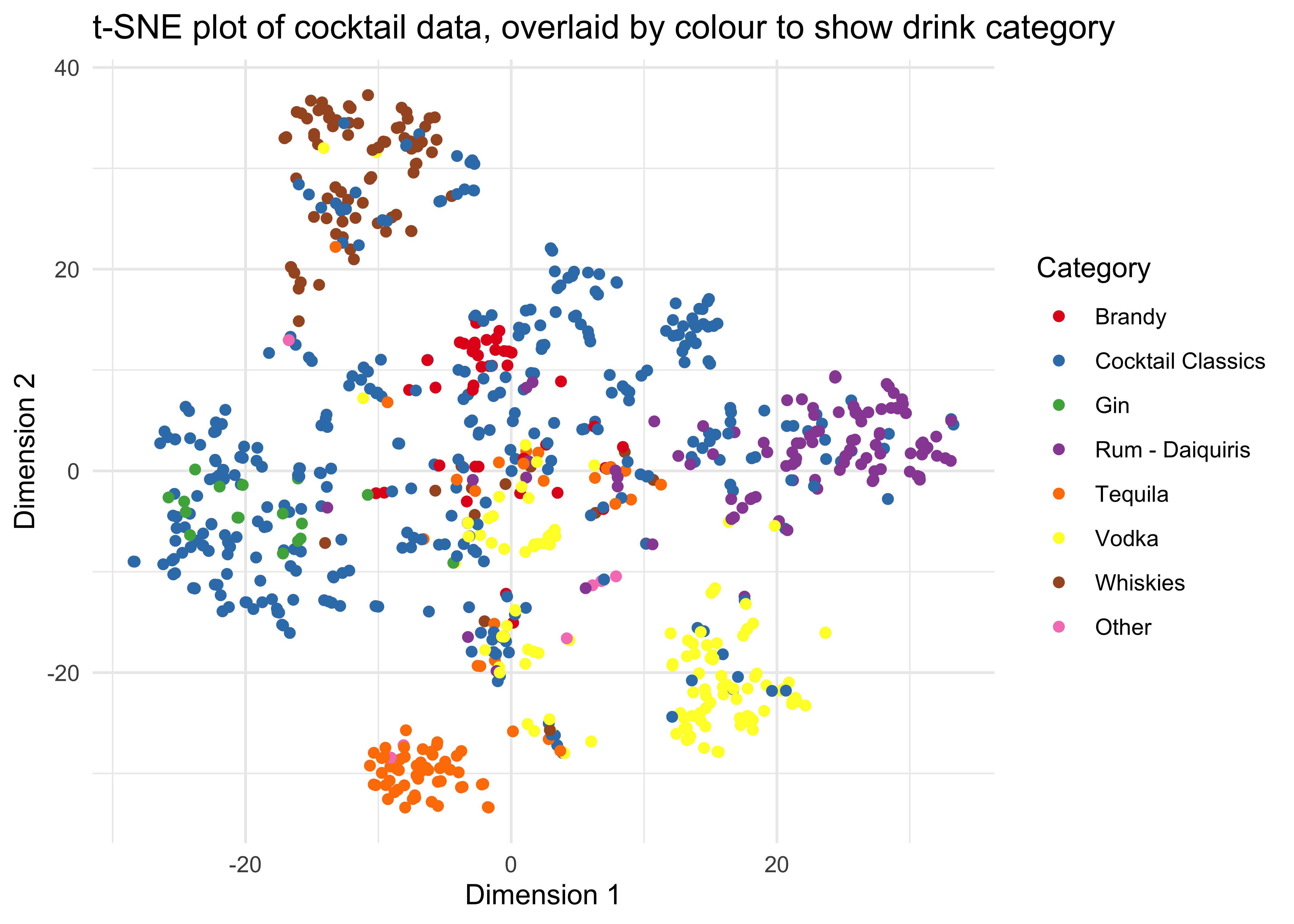
This is another interesting plot. We see fairly distinct clusters of drinks for the whiskey, vodka, brandy, gin and rum-based cocktails, with a mixture in the middle around (0,0). Meanwhile the Cocktail Classics coloured in blue overlap with pretty much all the other categories, although not so much with the tequila-based drinks clustered in orange and the vodka-based drinks clustered in yellow. It turns out that only 7 of the Cocktail Classics contain tequila and only 12 contain vodka so clearly these are are considered less ‘classic’ ingredients for cocktails.
Conclusions
- Lemon juice is by far the most common ingredient in cocktails.
- Gin, rum and whiskey are the most common spirits.
- Cocktails are all about tried-and-tested combinations of ingredients: gin with vermouth; citrus with egg and sugar; rum with lime; whiskey with bitters…
- Out of the spirits, tequila and vodka are considered the least “classic” as ingredients.